The importance of mobile-friendly websites

The impact of Augmented Reality in digital marketing
May 1, 2024
Driving website traffic through influencer partnerships
May 20, 2024
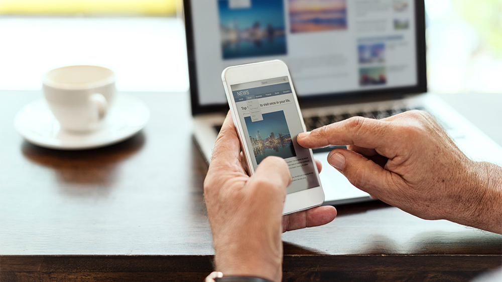
In the constantly changing digital world, how people get information has changed. Smartphones and tablets have become our regular friends because they let us connect quickly and get to a lot of different online content. This has made mobile-friendly websites even more important.
What is a mobile-friendly website and what does it matter?
A mobile-friendly website is tailored for smartphones and tablets to provide a great browsing experience. It considers mobile device features including smaller displays, touch-based navigation, and different network speeds. Mobile-friendly websites optimize usability and readability by changing layout, content, and functionality.
Here are some key reasons why mobile-friendly websites matter:
- Provide a smoother user experience with fast loading, simple interfaces, and clear, attractive content.
- Engage users, minimize bounce rates, and lengthen browsing sessions.
- Score higher in Google’s search results, increasing visibility and organic visitors.
- Reach more people, especially those using mobile devices, accessing new markets and customers.
- Boost conversions by building user trust and confidence.
- Adapting Mobile-First Indexing, which indexes and ranks websites based on their mobile versions.

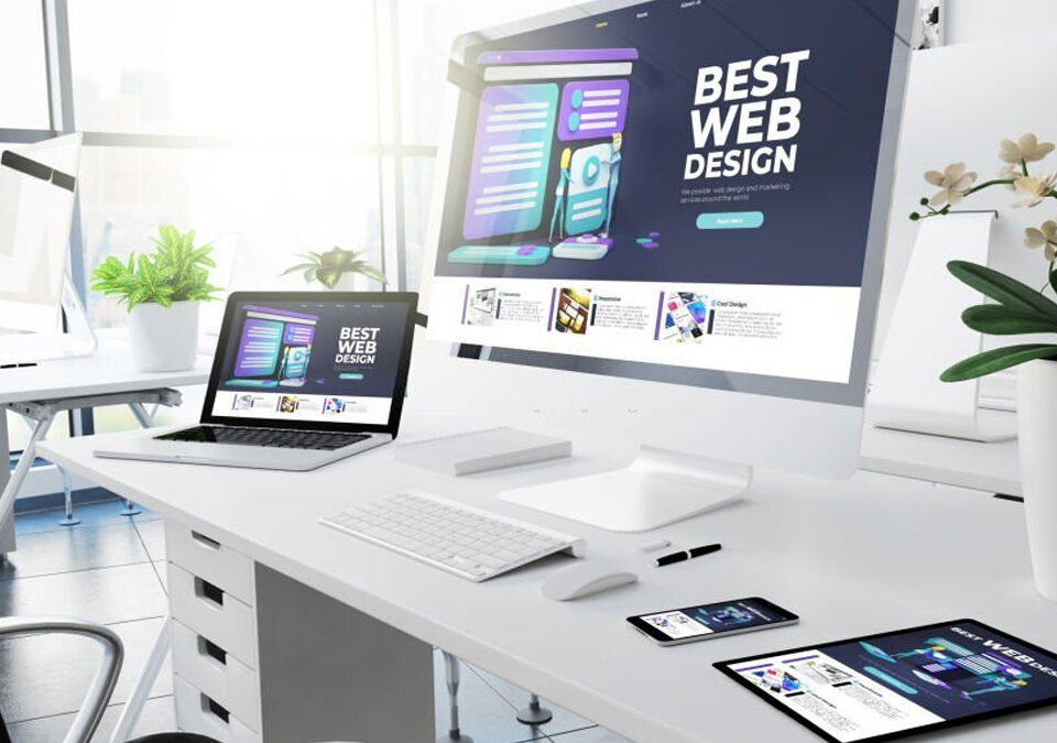
Responsive web design
To make websites that work well on phones, you need to use responsive web design. This method uses media queries, fluid layouts, and flexible pictures to make sure that websites naturally adjust to different devices and screen sizes. The respondent design makes the user experience better, saves time and money, improves SEO, and makes web design a crucial part of the marketing strategy.
The benefits of responsive design
For mobile-friendly websites, responsive design has various benefits:
- User experience: When you use responsive design, it’s easy to move around, read, and connect with information on all of your devices. This makes the whole user experience better.
- Saves time and money: Having one website that works on all devices instead of several versions speeds up development, saves time, and lowers the cost of maintenance.
- SEO: Responsive design agrees with what search engines say because websites that work well on phones get better search results. That helps people find you and raises your chances of getting a better search engine ranking.
- Future-proofing: websites can be made to work on new devices and screen sizes with flexible design, instead of having to be rebuilt from scratch. They will still be useful and important in the future because of this.
Tips for creating a mobile-friendly website
A mobile-friendly website is important now that most people use the internet on their phones. To make your website work better for mobile people, think about the following tips:
- Use flexible design: Responsive design ensures compatibility with various devices and screen sizes.
- Optimize website for mobile devices: Start with mobile-specific style and functions and gradually improve for larger screens.
- Make navigation easier: Use clear labels or expanding options, and make navigation choices for phones.
- Load pages faster: Use caching, compressing pictures, and minifying CSS and JavaScript for faster loading. Regularly test and improve website speed using Google.
- Use clear and easy-to-read fonts: Avoid fonts that are too small or hard to read for mobile devices.
- Make clickable parts easy to tap: Ensure buttons, links, and other clickable parts are large and well-spaced for easy finger tapping.
- Make forms mobile-friendly: Use large input areas, auto-fill, and type as little as possible.
- Optimize media and pictures: Reduce the file size of photos without compromising quality.
- Improve cross-device compatibility: Test and fix consistency issues on all devices.
Web design Service in Vancouver
If you’re looking for top-notch web design services in Vancouver, look no further than Cactus Media Group.
